Human-Centred Design Lessons for a Netflix Car Restoring Show

I was watching the new series of Car Masters: Rust to Riches on Netflix over the weekend and after seeing some classic design mistakes I had to write a quick post about it! (I tried explaining to my kids but met zero interest!).
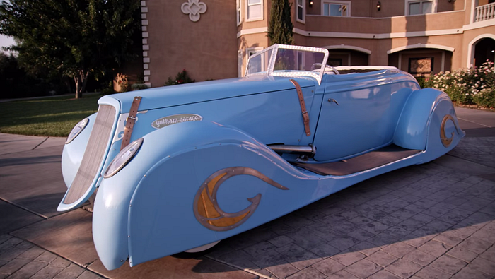
For anyone who hasn’t seen it, Car Masters is a show where five folks who work in Gotham Garage in Temecula, California, restore and build cars, either to trade for better cars to restore or for outright cash. There are some suspicions on how real the garage actually is, but we’re going to put that aside for now! (why is the place so clean?!)
Involve your customer in the design
The basic tenet of human centred design is understanding what your customers actually need, based on understanding more about them; as oppose to assuming you know what they want.
So, when we’re building a new solution in work we hold design workshops with our customers — to take a good look at the opportunity / challenge, understand the real requirements, ideate on possible solutions, prioritise based on value & required effort and so on. When we actually start building, we like to have weekly demos where we show what we’ve been working on over the last week, get feedback and then change / pivot / continue as needed. We also have informal communication channels — Teams, Slack etc to fire off any questions we may have for clarification, at any stage.
What I saw on Car Masters however was (seemingly! who really knows as it could just be edited this way!) more or less the exact opposite of this. The garage got an old Ford replica and $60k to turn it into a “Delahaye” replica; a famous type of car from the 1930s. The garage appeared to get minimal input from their customer, and made some design decisions on their own — namely including a custom $4500 steering wheel (that looked like it was from My Little Pony) and a custom dash with modern gauges.
The outcome? The customer didn’t like the steering wheel or gauges and the garage needed to make expensive changes to put in what he really wanted — a classic interior to match the exterior.
The lesson
Always include your customer all along the way! We may think that what we’re going to build for someone will blow their socks off and they’ll realise that we’re Picasso & Steve Jobs kind of melded into an engineering & design genius, but most likely you’ll build something they weren’t expecting and may not like.
I’ve encountered this multiple times on projects — even when customers tell you explicitly what you want, once you ask to meet the day-to-day users the picture may change, and when you then ask to observe the users in action, you may find it’ll change again!
So, run those collaborative workshops, get early design mockups over to the customers asap, and show them regularly what you’re doing and any decisions you’ve been making. It’s not about encouraging micro-managing, it’s about including the end-users in the creative process to make sure they’ll be happy at the end, and that you realise as much value for them as possible.
ps. I still love the show! They build beautiful cars and as I said, the show could just be edited like this for drama, maybe they’re completely following the agile manifesto and human-centred design principles!
Any thoughts, just let me know below.
